ITMS completely redesigns a popular client magazine it originally launched and created for a well-known incontinence and skin care brand six years ago.
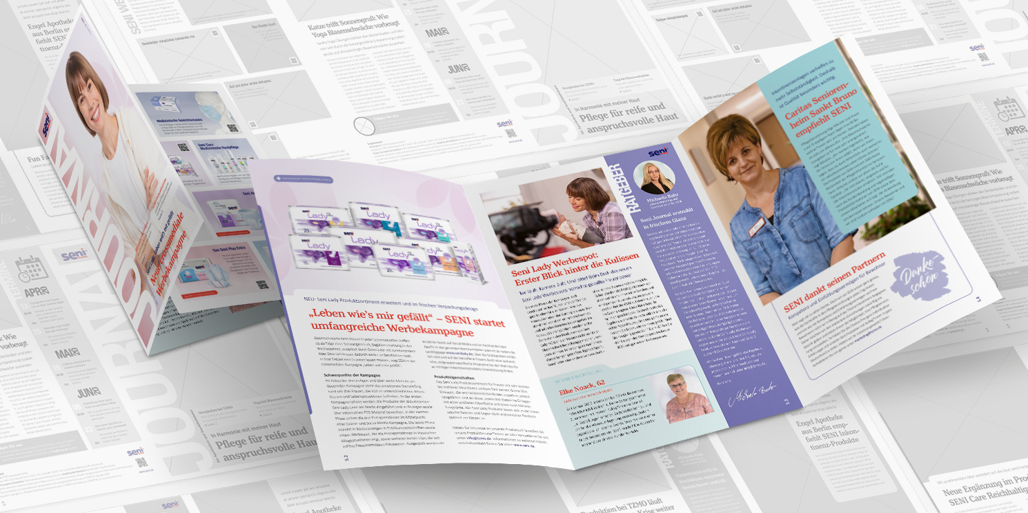
When readers of SENI’s client magazine opened their mail at the start of this year, they were greeted with a completely redesigned quarterly. Seni Journal, as the newsletter is called, has been restructured and given a fresh look, with more space for graphics, images and more in-depth stories. SENI‘s agency ITMS, made up of a team of copywriters, public relations, illustrators and design experts, knows how to best convey relevant content to guide readers through the brand’s narrative and deliver valuable stories. An extra bonus – the new photographic exterior creates renewed attention for the brand.
As ITMS Account Director Carolin Pascal explains, the redesign is about hierarchy. “Which is the most important story that we want the reader to understand when taking the newsletter in their hands? What are the other condensed and concise things they need to know, and how can we deliver a rich brand experience? Those are just some of the broad questions that we ask ourselves at the agency when you’re designing a client magazine”. Customers of the incontinence and skin care brand primarily include pharmaceutical wholesalers, medical supply retailers, pharmacies, drug stores and eldercare facilities, which bring very different requirements to the table. To ensure that the content is relevant for the different target groups, the agency publishes several versions of the quarterly. The content includes information on products and events, as well as valuable tips and news about happenings at the company. During the redesign, the journal was expanded from four to six pages, creating space for new topics and a clean and clutter-free design.
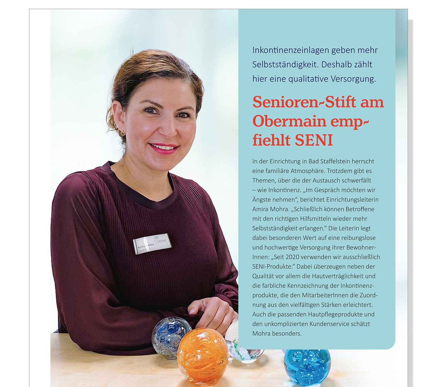
Staff and client portrayals bring a personal touch to the journal. Service staff at TZMO Germany, owner and distributor of the SENI brand and one of the largest suppliers of a wide range of personal health and consumer health brands, are individually portrayed. The customers or partners, as they are called at SENI, are also featured. In each issue, a pharmacy, medical supply store or other retail business is featured. SENI’s range of products are part of the everyday for these health professionals which turns them into real-life testimonials in the easy-to-read short narratives. Important dates, campaigns and events are moved into focus on the back cover. In addition to important campaign dates, readers can quickly find relevant seminars and events that SENI organizes throughout the year. A full-page devoted to the product series is another new feature in the redesigned journal. This creates an opportunity to better present the product range, feature special offers and promote seasonal sales.
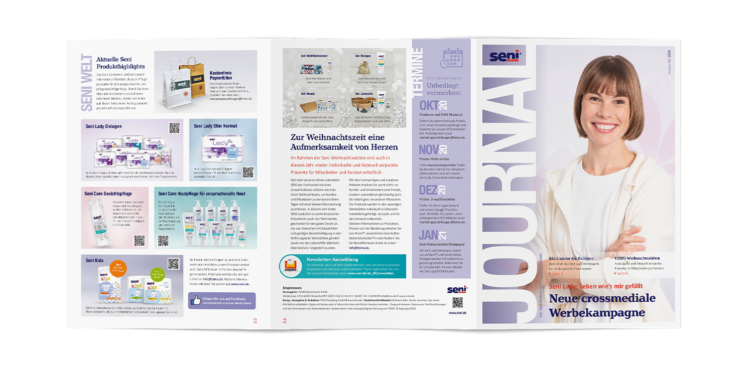
The design and layout of the publication received a complete makeover in the process. The arrangement of the sections in individual boxes looks modern and clean. The primary goal of the redesign was to make it easy to read. Not only was a serif font chosen for this purpose, but the texts must adhere to specific guidelines to ensure that they are easy to read. Shorter sections increase the chance that the reader will read the full story. A graphical separation of topics does not specify a reading direction but allows for a sensible sequence of navigation. Nevertheless, the newsletter remains well-organized. Particularly the high-quality images and fewer colors that match the company’s corporate design make the journal a real eye-catcher without making it look like its cluttered. The agency’s designers are particularly proud of the elaborately finished cover, which invites the reader to dive in. The use of large format photography on the cover evokes a sense of clarity that is reminiscent of a lifestyle magazine’s cover.
There is more to the sophisticated strategy that the Hessian agency had in mind for the redesigned journal: The format can be further adjusted and customized. The possibility of future issues by e-mail instead of by post will open new doors. The advantages here are obvious: It’ll be faster, save in printing and postage costs and could also attract new target audiences.
Can your newsletter also profit from an upgrade? Or would you like to launch a client magazine from scratch? Contact us, we’ll be happy to provide you with expert support.